Path Robotics
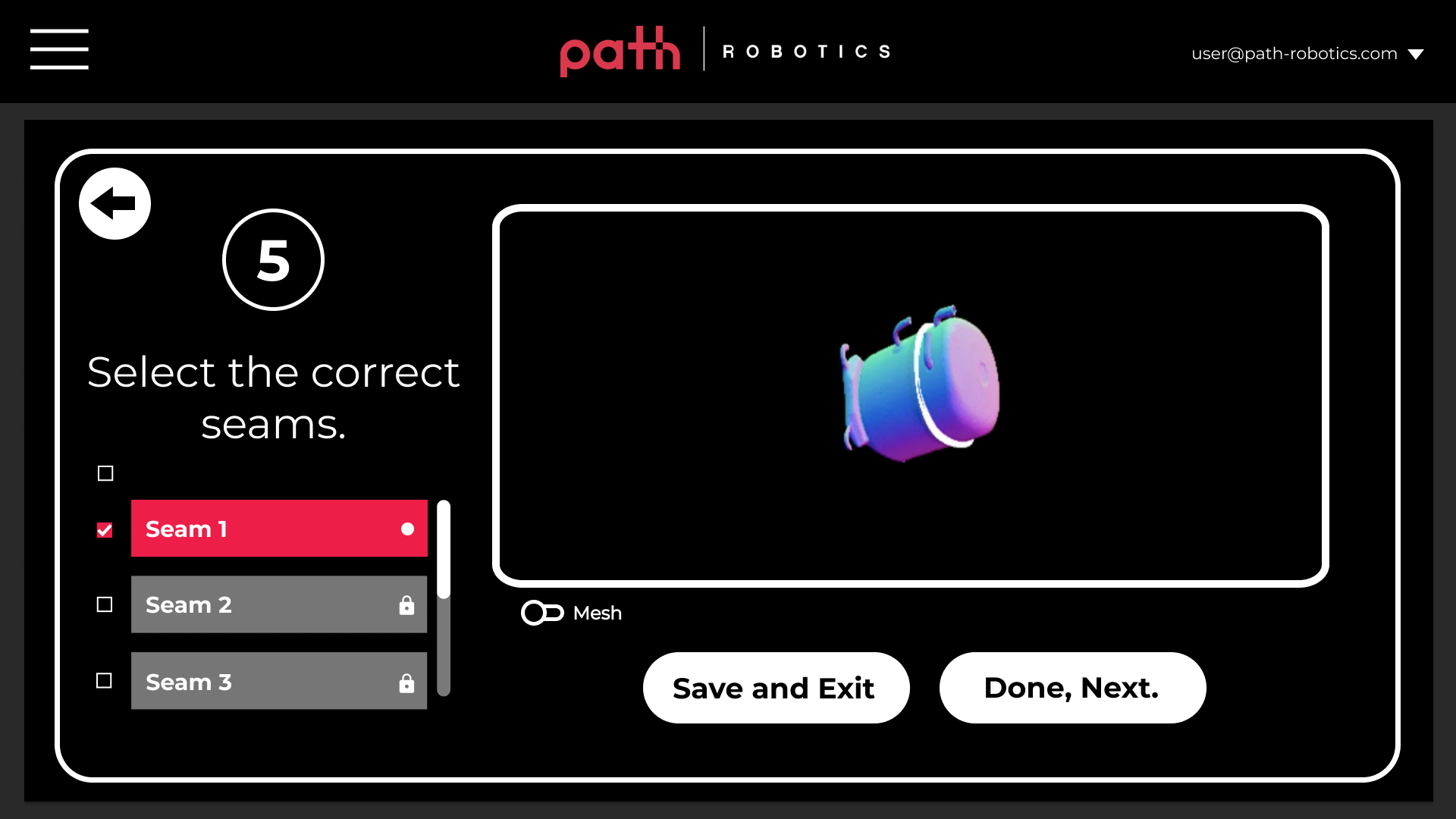
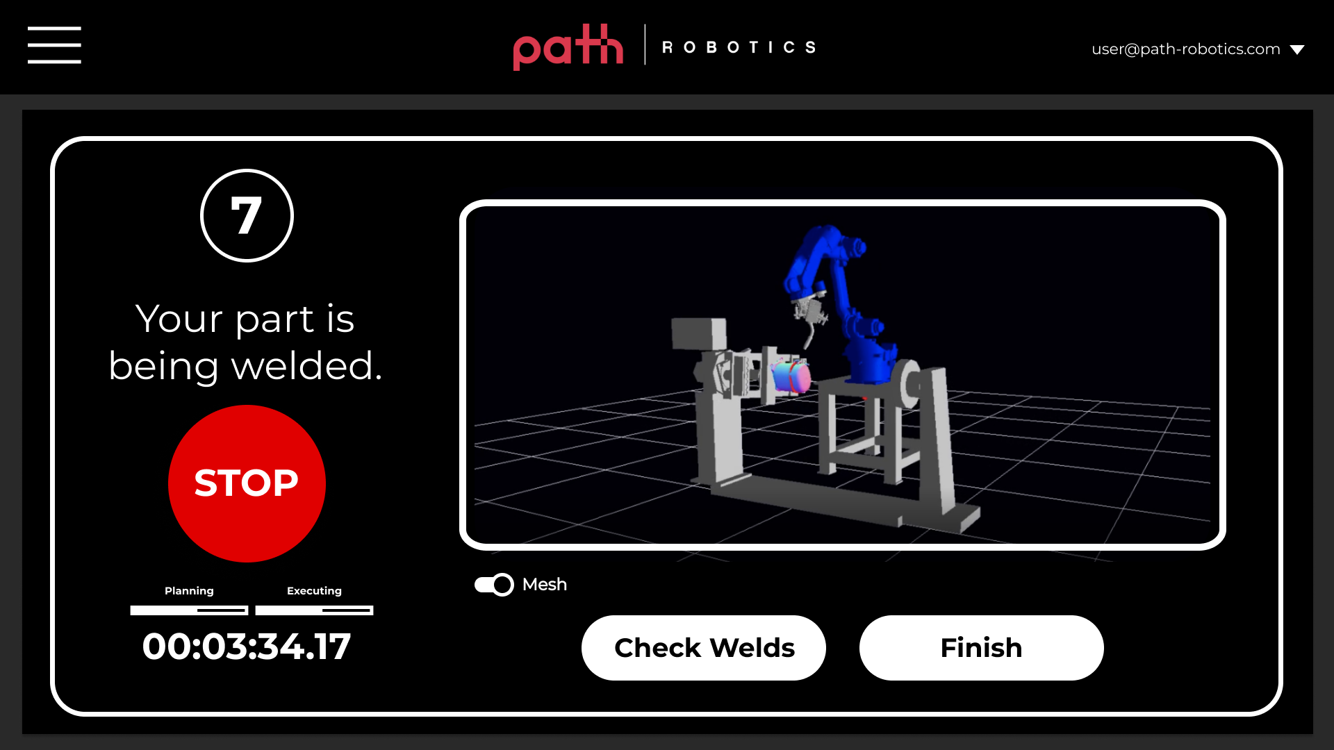
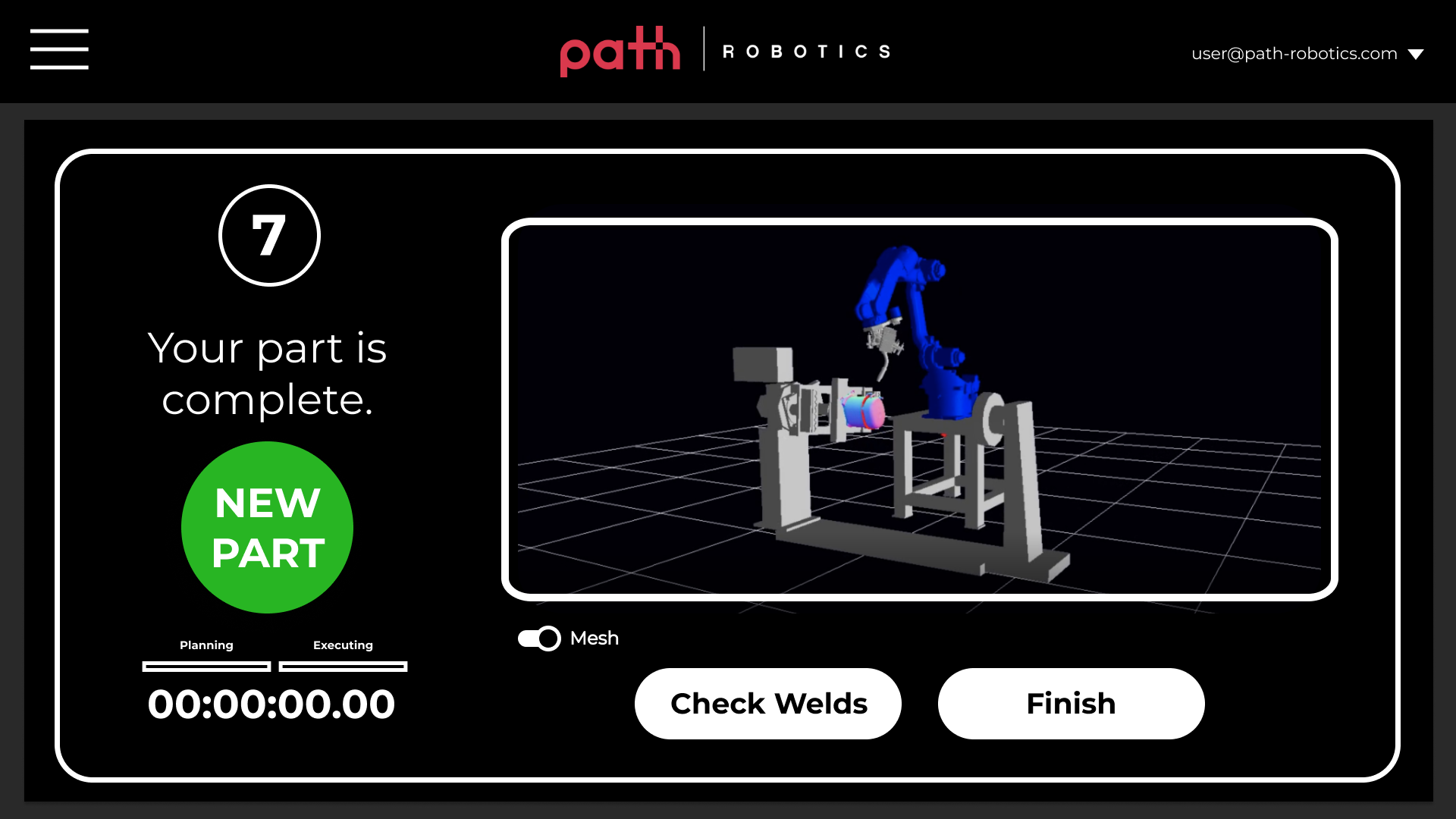
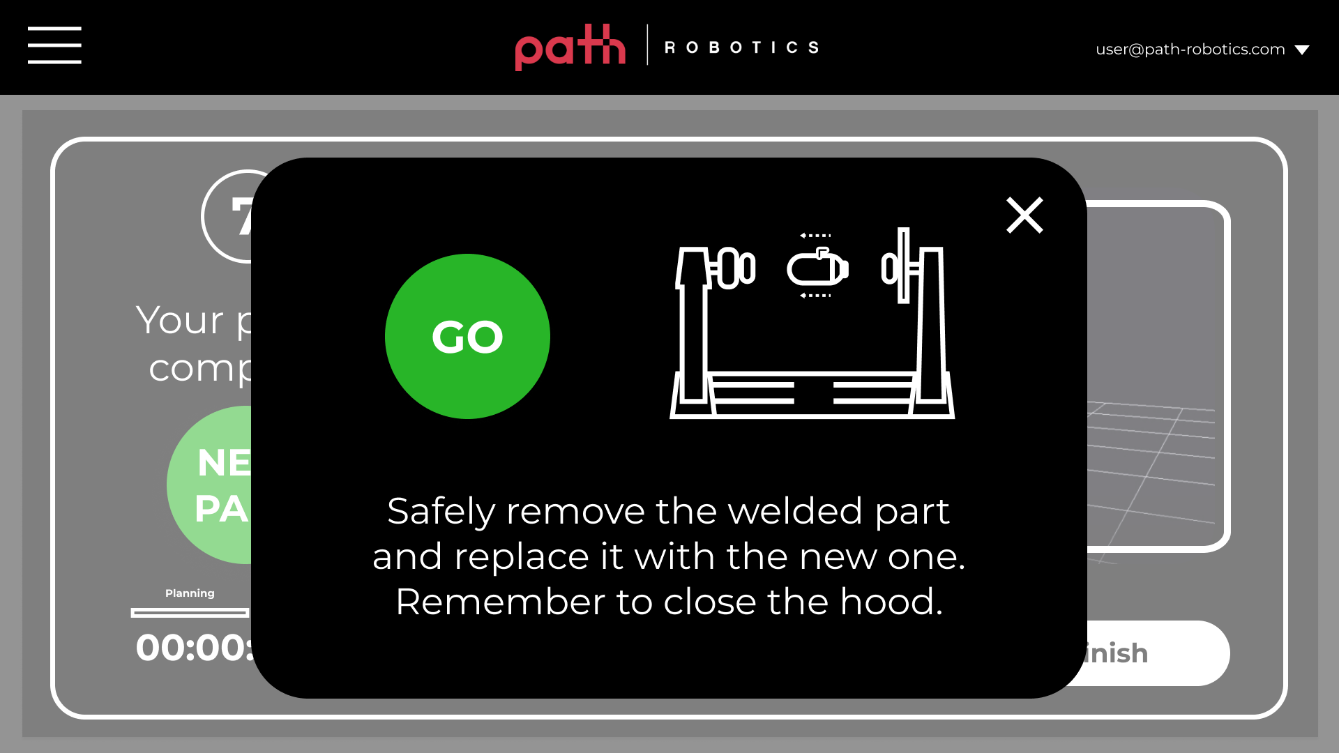
The following project was the process involved for building the Cell Operation Screen, the tool used to direct a welding robot to scan and weld a variety of parts. It acts as the touchpoint between man and machine.
The promotional video above shows my screen design in action.
-
12-week project
Solo Designer
Engineer Collaboration
Summer 2020
-
Product Designer
-
Peer Research
User Research
User Interviews
Insight Gathering
Sketching
Ideation
Prototyping
Product Presentation
-
HMI
Touchscreen
Web Tool
Introduction
I was tasked with simplifying robot operation for a user who doesn't need to know complex ins and outs of the system.
When I was first introduced to the robot, successfully operating it was impossible for a non-technical user, as it was broken up between browser and command line actions. The robots are meant to be shipped to welding companies and operated by their non-technical employees.
Understanding how welding robots work can be tough. My job was to make operation as simple as possible.
The set of diagrams from the Path Robotics website explains in simple terms how robot welding works. When I joined the company, none of this copy or imagery existed; I was the first to embark on this explanatory process.
Preliminary Peer Research
I began sharpening my own understanding of the product by speaking to every company Team Lead for 6 interviews.
I noted how the various stakeholders described their domain and how it contributed to the entire product in plain terms. This helped to inform a simplified chronology of the welding process.
How Might We
How might we streamline the autonomous welding process for users who are not responsible for a complex understanding of how the robot functions?
Preliminary peer research helped to refine a design problem from the original prompt provided by my Software Team Lead.
“We create manufacturing robots that autonomously scan, position, and weld your parts without the need for skilled welders or robot programmers.”
User Research
What's it like to work with the robot on the manufacturing floor?
I conducted 3 field interviews with employees on the manufacturing floor of one of our clients. Since this project was early in my company’s life, this client had the only deployed beta version of the robot in existence on their manufacturing floor, and these were the only appropriate individuals to interview. The interview questions functioned to uncover the needs and frustrations of those who were already operating the product.
Each of the three individuals I interviewed represented a major stakeholder at our future clients' companies: robot operator, floor manager, and operations director.
Sensemaking
I created interview summaries, user personas, and journey maps of each participant in order to characterize the daily life of each user and synthesize key takeaways from their interviews. I cannot include the other documents due to a non-disclosure agreement, but can provide them upon request.
The user Persona, Harry, is a translation from a singular interview, which is not common practice, but allowed for easy knowledge transfer to incoming project managers as Path continued to rapidly hire.
Primary Research Insight
Robot operations currently requires a super user, but that person's time is precious and constrained by other responsibilities.
The super user cannot easily delegate robot operation to anyone, which bottlenecks the robot's efficiency.
“There are always little accomodations that have to be made on a regular basis... to make sure that the systems are welding... in the way that they’re supposed to. It’s all about the details.”
Design Prioritization
The insight suggests that the operator's interface must reduce the complexities that operators face when working with the robot.
By simplifying the scan and weld process, operators of lower skill will be able to transfer their knowledge and reduce their status as a bottleneck.
Design 01
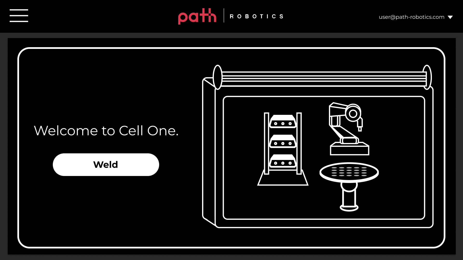
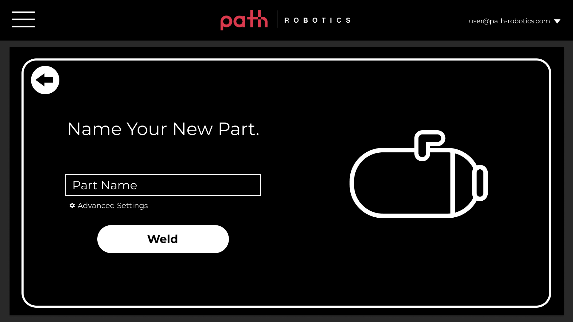
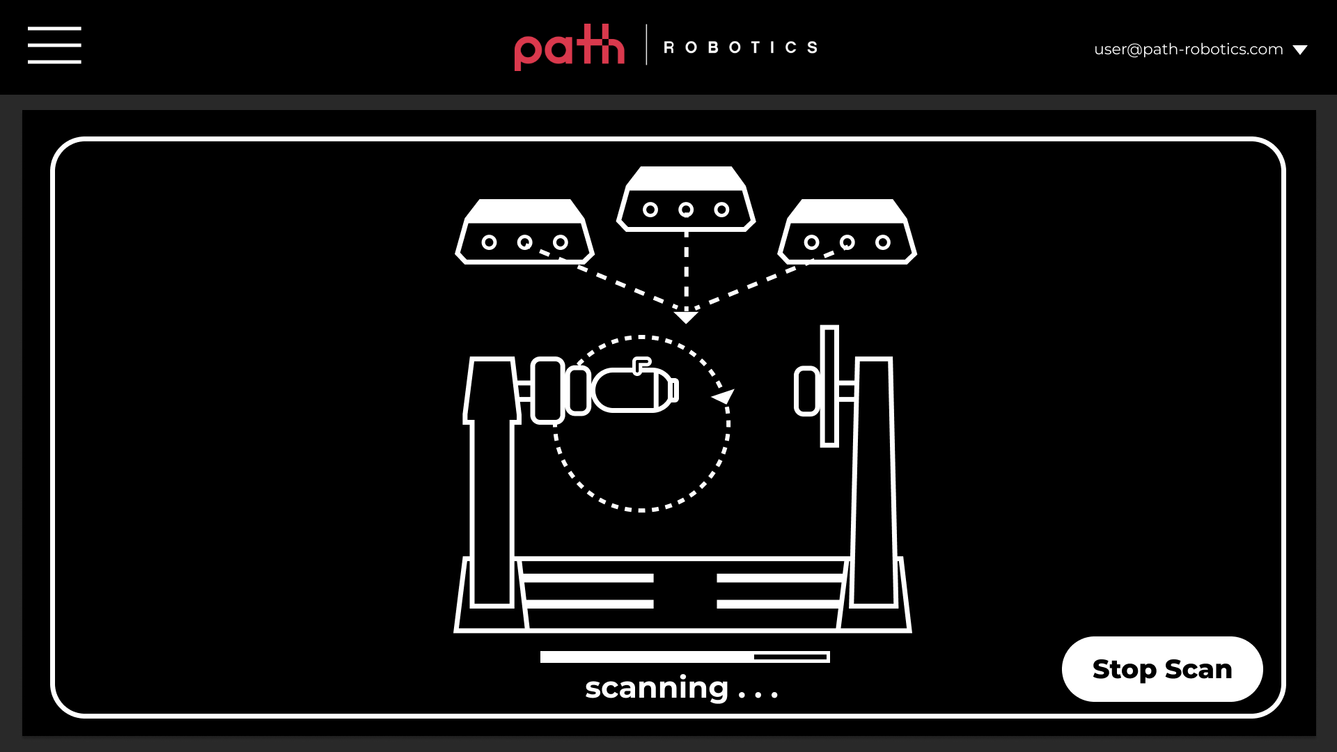
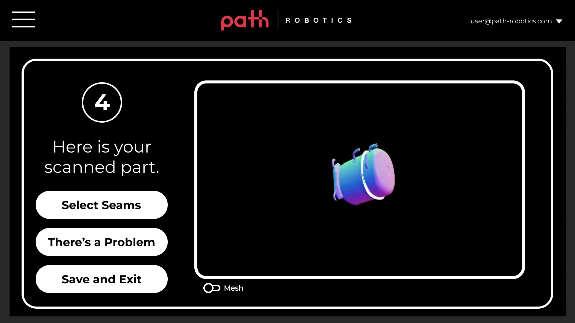
The original design provides a step-by-step guide for following the robot’s scanning and welding process.
The style mimics an instruction manual and invokes the joyous feelings of simple task completion emphasizing simplicity. In collaboration with the engineering team, the entire process was localized on a website, accessed by a browser, which incorporated some of the tasks that previously required command line actions.
The design was OK'd by multiple teams, translated from greyscale wireframes, and executed rapidly, due to an influx of interested buyers who requested on-site demos of the technology.
Design 01 Flow Diagram.
Feedback
"This is too simplified."
Since the design was quickly built out and put in the hands of employees at my company, they were able to use it while they tested out the robot, in lieu of customer feedback (as we had no customers at the time). Initial responses were generated through their experience with the tool. Internal users began to criticize the design, stating that they didn't need their hand held through a multi-step process each time they welded a part. Essentially, the design was great for a first demonstration, but users wanted something else shortly afterwards. This feedback was reported to the Sotware Team Lead, who funneled it back to me.
Thus, Design 01 became a tool for showcasing the capabilities of the product when potential clients came to visit for demos, and I focused on a reiteration.
A LinkedIn post by my company showcases how engineers controlled the robot during on-site customer demos. Customers remarked that the simple interface was unprecedented in their domain.
Design 02
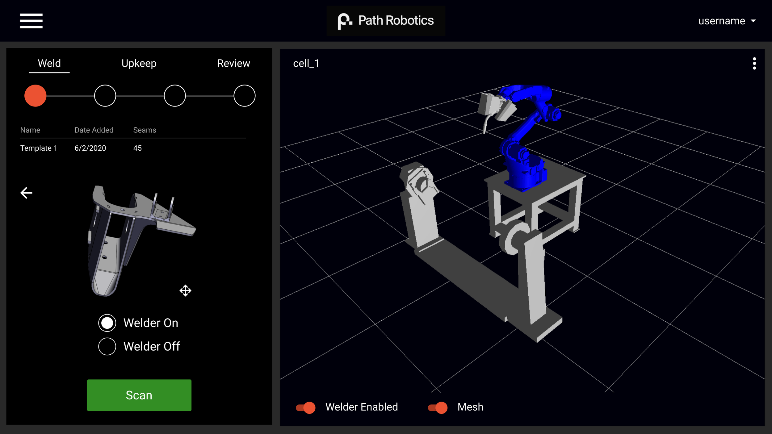
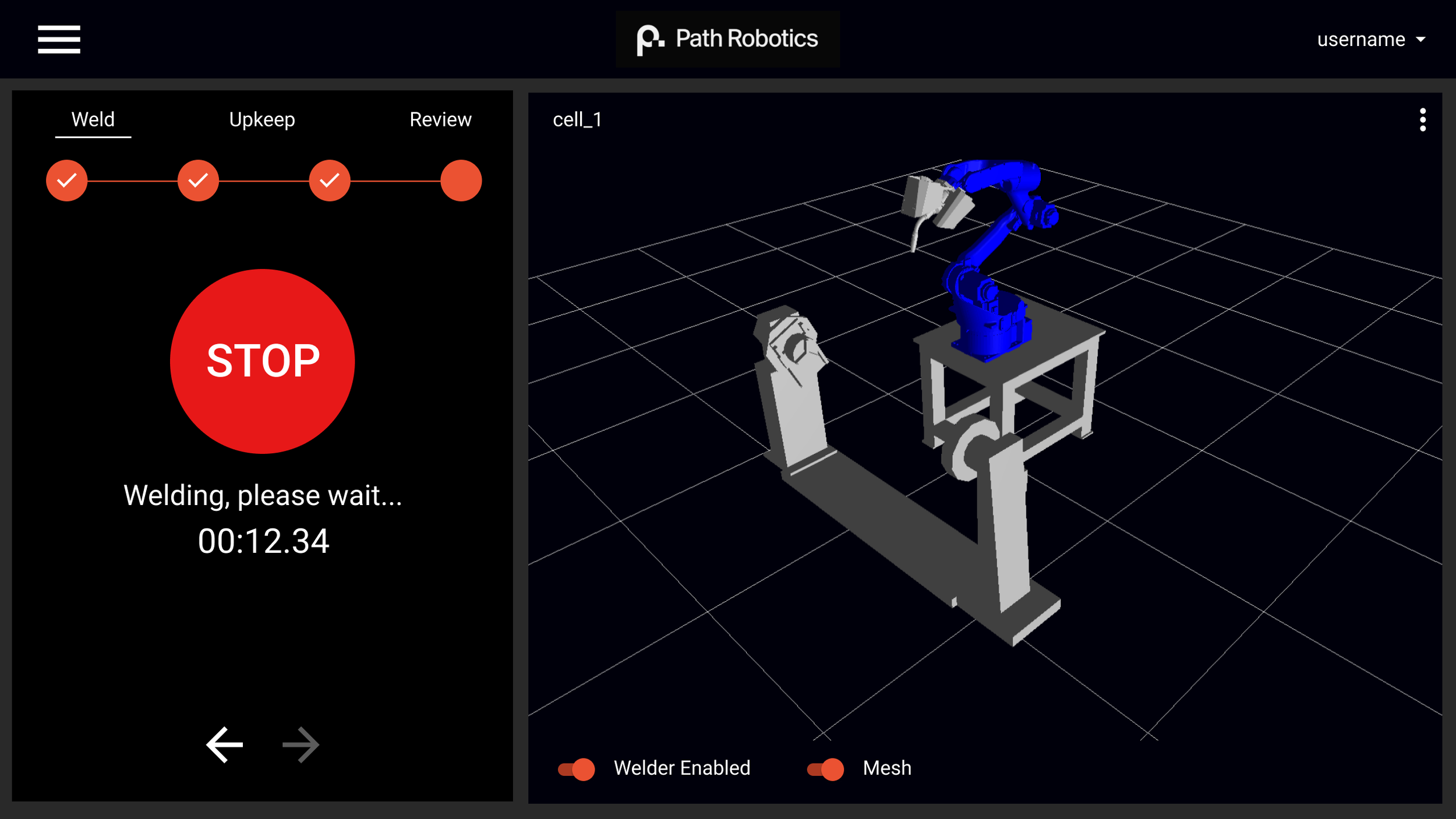
Design 02 powers users through scanning and welding as fast as possible.
The follow-up, known internally as “single-screen cell operation,” contains less explanatory power than Design 01.
It provides a 3D view of the cell so that users can see whether or not the system recognizes that a part is inside the cell, ready to be welded (this is additionally helpful for safety reasons). Due to critical need for the interface, the design was swiftly built by collaborating with software engineers once again, and was met with excellent feedback internally. Users appreciated the entire process happening without any page redirects, and remarked at their increased effiency. Without any backend knowledge, I and others were able to use the new interface to successfully weld a part.
This video demonstrates how the welding robots operate, as it relates to hardware and context. My design is included on the tablet screen showcased in the video, which robot operators interface with.
Impact
The cell operation screen is now the means by which clients operate Path’s welding robots on manufacturing floors.
Feedback and critique of the design was largely sourced internally. External operators are just now getting their hands on these interfaces.
Operators no longer need to be super-users in order to weld parts with our technology, so multiple users can have agency over the system, allowing for greater productivity out of the robot!
The above video demonstrates how my streamlined designs have helped the company demonstrate their technology seamlessly and secure multi-million dollar manufacturing partnerships.


